LUXY MEDIA
REBRAND
Based in Montreal, Luxy Media is an internet marketing agency specializing in web design, SEO, social media, and brand growth across various industries.

Context
There were two primary reasons behind the Luxy Media rebrand:
-
Competitive Differentiation: While Luxy Media already held strong recognition among existing clients, a refined brand aesthetic would amplify its visibility, attracting new clientele and boosting market presence.
-
A Fresh Digital Identity: A revamped website was needed, one that would seamlessly scale across devices, showcase the company’s culture, highlight its services, and feature client portfolios effectively.
Goals
Our rebrand focused on:
-
Preserving Luxy Media’s name, but in a fresh, modern format
-
Refreshing all brand assets - new brand guide, social media visuals, stationery, digital, and print materials
-
Exploring new conceptual directions for the Luxy Media website
My Role
I led the entire rebrand design process, from early concept development to final execution, ensuring alignment with the team’s strategic vision. Additionally, I developed motion pieces & interactive mockups to bring the new experience to life.
Team
Founder
Marketing Director
Web Developer
Partner
Camera Crew
The Journey
Refining the Brand Identity

The original icon + lettering combination posed a challenge, it lacked clarity and sometimes distracted users from recognizing the brand efficiently.
My first priority was to simplify the structure, ensuring the brand name remained strong, clear, and visually impactfulwhile maintaining a dynamic typographic presence.


Rebrand teaser
Building a Brand Language That Reflects the Team
Beyond aesthetics, branding is about people, and Luxy Media is a young, high-energy team. The new identity needed to embody its fast-growing pace, ensuring the brand voice felt bold, fresh, and forward-thinking.

Brand Guide V2
Exploration Stages
Stage 1: Stress Testing the Identity
To evaluate the adaptability of the new design, I tested it across digital and print mediums, including landing pages and stationery. One exciting aspect was the diagonal proportion of the logo, which introduced a dimensional perspective, enhancing its depth and dynamic presence.

Concept Demo
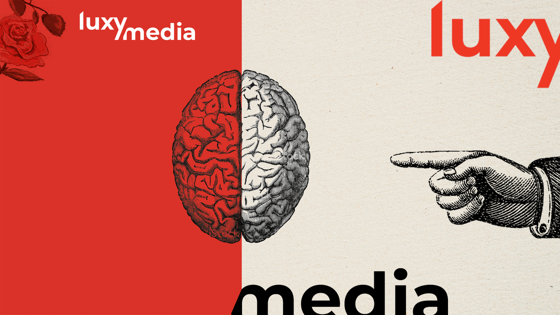
Stage 2: Color & Contrast Iterations
Experimenting with bold color themes and high-contrast compositions, I refined the visual experience, ensuring the brand felt vibrant and engaging. Added textures introduced more depth, reinforcing Luxy Media’s energetic personality.

Stage 3: The Team’s Pick
To further enhance storytelling, we explored rich imagery that brought Luxy Media’s brand narrative to life, making the identity feel more expressive and immersive.

Final Concept
